This is part I of a three-part series. Read Part II. Read Part III.
***
So you’ve finally decided to splurge on a great necktie.
You’re at your favorite store, you’ve felt the tie, and you love the way it drapes when you try it on. You’re ready to pay, until suddenly a nagging doubt emerges.
What are you going to wear this tie with? It may be sleek. It may be made of silk with woolen interlining. The knot may be perfect.
But if you don’t know how to pair this tie with the
EG readers know: Color, pattern and fabric coordination with clothing is vital. But when it comes to neckties, this can be tricky, so we need to be educated.
The reason matching accessories is so difficult for so many is because it is a tertiary layer of clothing. The tie’s success or failure is dependent on the backdrop of the
Being able to eloquently match a necktie to your suit and
- Matching Tie Colors to your
suits andShirts - Matching Tie Patterns to your
suits andShirts - Matching Necktie Fabrics to your
suits andShirts
All three factors are critical, which is why we teamed up with Effortless Gent to bring you this three part series on matching ties to
Your greatest ally
When it comes to matching tie colors with
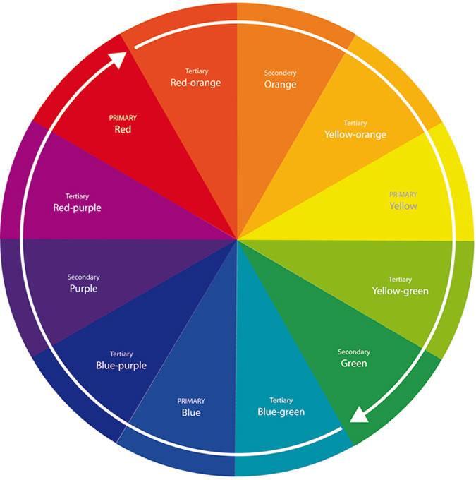
The Color Wheel was designed to explain how colors work together. As you’ll see above, it is largely divided into two main groups, warm and cool colors. Warm colors include red, orange and yellow, and represent warmth and vibrance. Cool colors include blue, green and purple, and represent calm, foliage and a sense of relaxation.
The right color pairings will, engage the viewer create a sense of balance from a visual perspective. This ideal, balanced look is called harmony. A color scheme is considered ‘harmonious’ when there is a balance between warmer and cooler colors.

To help illustrate, here are color schemes from low to higher degrees of color contrast and intensity:
Monochromatic: This color scheme, as the name suggests, involves choosing colors from the same ‘spoke’ of the color wheel. Hence, a light blue
Similarly, a light pink
Analogous: An analogous color scheme involves choosing colors that are close to each other on the color wheel, hence providing a low level of contrast. Examples of this would include a light blue
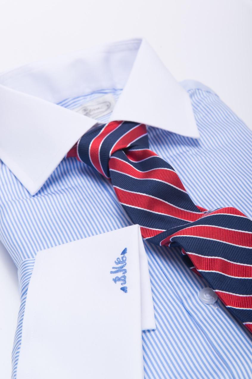
Triadic Color Scheme: A Triadic Color Scheme involves choosing colors that form a triangle within the color wheel. Examples of this include blue, red and yellow, and purple, green and orange.
However, given how strong the purple, green and orange combination sounds, I would stick with the Blue, Red and Yellow combination. As mentioned above when discussing the theory of harmony and balancing colors, a triadic color scheme introduces the concept of harmony in a subtle way.
With warm and cool colors paired against each so seamlessly, it comes as no surprise that a blue
Complementary Color Scheme: This color scheme is the boldest of the four mentioned here. A complementary color scheme involves choosing colors on the color wheel that are directly across from each other, forming the strongest contrast.
Examples of this include ‘warm’ and ‘cool’ combos like Red and Green, Blue and Orange and Purple and Yellow. Because we are pairing warm and cool colors that are diametrically across from each other on the color wheel, we are creating a scheme with the boldest visual contrast.
While red and green is generally reserved for Christmas, and purple and yellow combinations are very rarely worn, a blue
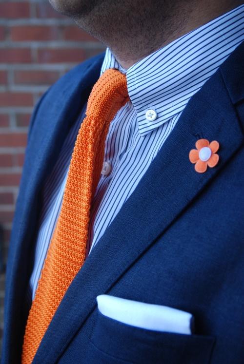
Quick Tip: When choosing a tie color, take the dominant color of the
shirt as a secondary color of your tie. This creates even more of an aesthetic pop that will set you apart.
Solid
When first experimenting with mixing and matching tie colors, it’s best to start with a solid
Blue
The most common staple in a man’s formal wardrobe (besides his white
- If you are looking for a more conservative look, a light blue
shirt with a navy blue tie (‘monochromatic’, remember?) always provides a classic, elegant look, especially with a charcoal grey solid or pinstriped suit. - If you are starting to step out of your comfort zone, an analogous color scheme will work. During the Fall and Winter Seasons, a darker green tie (representing foliage) would work perfectly with a lighter blue
shirt , as would a darker purple. A standard purple tie would work great during the Spring and Summer Months. - If you are ready to get more bold by introducing color harmony, a blue
shirt pairs perfectly with a red, pink or burgundy tie. That’s that ‘triadic’ color scheme we talked about. - And finally, if you are ready to elevate your bold dressing to the next level, you can opt for a complementary color scheme and go for an orange tie with your blue
shirt !
Pink
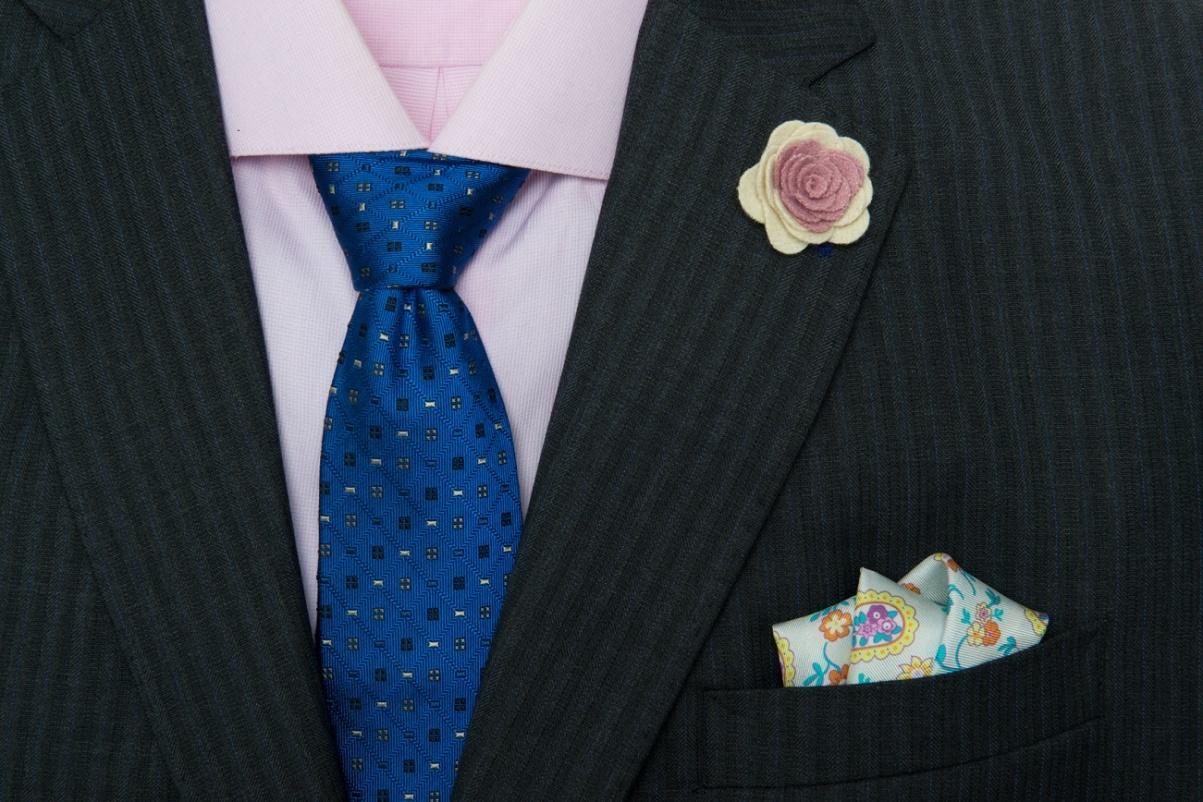
As gentlemen are getting bolder with their sense of dress, the pink
- For a more conservative look, a monochromatic color scheme with a burgundy tie will suit you perfectly. This will create an elegant look without looking overtly bold.
- If you‘re looking for something that is contrasting but not too strong, an analogous color scheme would work well. Like a dark purple tie with a light pink
shirt . Note that in this analogous example, we are actually pairing a cool color variant (purple) with a warm color variant (pink), but because they are adjacent on the color wheel, the contrast isn’t as strong as the next two options. - If you are looking to introduce a stronger sense of color harmony and contrast, a pink
shirt will work exquisitely with a blue or navy blue tie. This will create an element of harmony and enough contrast to create visual interest. - If you’re looking for that ‘next level’ look, you can opt for a darker green tie with your Pink
Shirt !
Quick Tip: When finding ties that match your
suits andshirts , it’s best to opt for a tie that is darker in shade than yourshirt . The goal should be to build your attire with a subtle backdrop (shirt) and work your way up towards darker ties. As we will see in the ensuing articles in this series, the same rule generally applies with patterns as well, as we start with basic, understated patterns and work our way up towards more complicated ones.
What tie colors signify
Now that we have gone over the basic properties of color and a color wheel, let’s look at what each of the below tie colors represent and which personality types and types of events they are suited for:
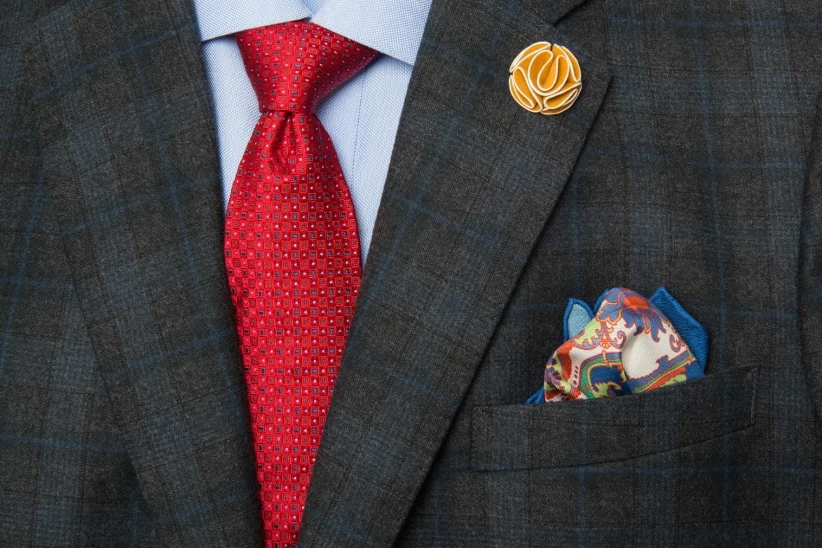
Red Ties: These are perfect for the ‘alpha male’ personality type. A red tie demonstrates power and a sense of authority. They are also highly suited for presentations or other similar settings where one is looking to demonstrate a sense of control.
Blue Ties: Blue ties are best associated with affable, approachable people. Most of us generally like to come across that way, which probably explains why blue ties are such a popular choice. These ties are ideal for daily work wear, and can also be worn to more social events such as an evening out or a daytime wedding!
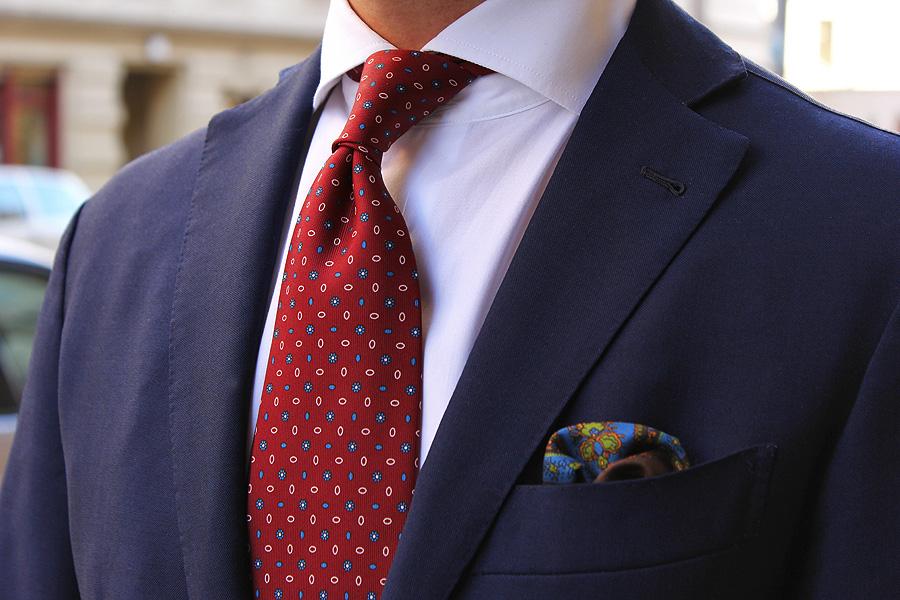
Burgundy / Navy Ties: These two tie colors represent an inherent sense of maturity and trust, and are ideally worn for a more mature look. These colored ties are also ideal for business settings, as they demonstrate that you are reliable and professional.
Pastel Colored Ties: These are the lightest natured of the ties, and generally include light blue, pink and lilac. They can be worn daily to work should be avoided for more formal occasions such as presentations, a meeting or an interview. Pastel colors signify friendliness and are therefore great for evenings out or for social events.
Seasonal Considerations
The last relevant factor that we would like to consider in this article are seasonal considerations:
- Spring and Summer seasons are best suited for pastel colored ties. These ties exude a sense of casualness but can also be worn to work if the pattern is appropriate.
- Fall and Winter Seasons are best suited for darker colored ties that are associated with foliage and colder months, such as olive green, mustard yellow, burgundy and navy.
Summary
Thanks for having read this far! This was a lot of information to digest, so I’m going to summarize the most relevant points here:
- When deciding on a tie color that will complement your
suits andshirts , start with a color wheel, which is largely divided into two camps: Warm and cool colors. The more conservative color schemes will use just one or the other, whereas schemes with true harmony will balance both warm and cool colors. - In increasing level of contrast and intensity, the major color schemes you can use are: monochromatic (same colors with varying levels of intensity e.g navy tie against blue
shirt ), analogous (adjacent colors on the color wheel, e.g purple tie against light pinkshirt ), triadic color scheme (colors that form a triangle on the color wheel, e.g a red or yellow tie against a blueshirt ) and complementary color scheme ( colors that are diametrically across each other on the color wheel, thereby creating the strongest contrast between warm and cool colors e.g orange tie against a blueshirt ). - A great tip when choosing ties is to find one where the predominant color of your
shirt is a secondary color within the tie. This will help to create further visual interest in your attire. - When choosing an appropriate tie, it is best to start with a more subdued, muted
shirt and to work your way up in intensity and contrast with the necktie, thereby creating the sharpest look! - Final considerations to take into account when choosing the right tie include personality type, the type of occasion being attended and seasonal considerations.
- For more assertive individuals, a red tie will do the trick, whereas if you want to come across as more affable, a pastel colored tie works great. Navy and Burgundy ties demonstrate dependability and professionalism.
- For presentations, red, navy and burgundy ties work well, whereas pastel colored ties are best with less formal occasions.
- Navy, burgundy, mustard yellow and olive green ties are best suited for the Fall & Winter Seasons, while pastel colored ties look best during Spring & Summer time!
***
The Dark Knot is a men’s accessories line carrying silk ties, linen and silk pocket squares and lapel flowers. They also offer Free Style Consultations to help you choose ties, pocket squares, and lapel flowers that will best suit your existing wardrobe and lifestyle needs.
You can also choose ties based on occasion and by matching
The Dark Knot is happy to offer Effortless Gent Readers 25% off using code EG25 at checkout.
